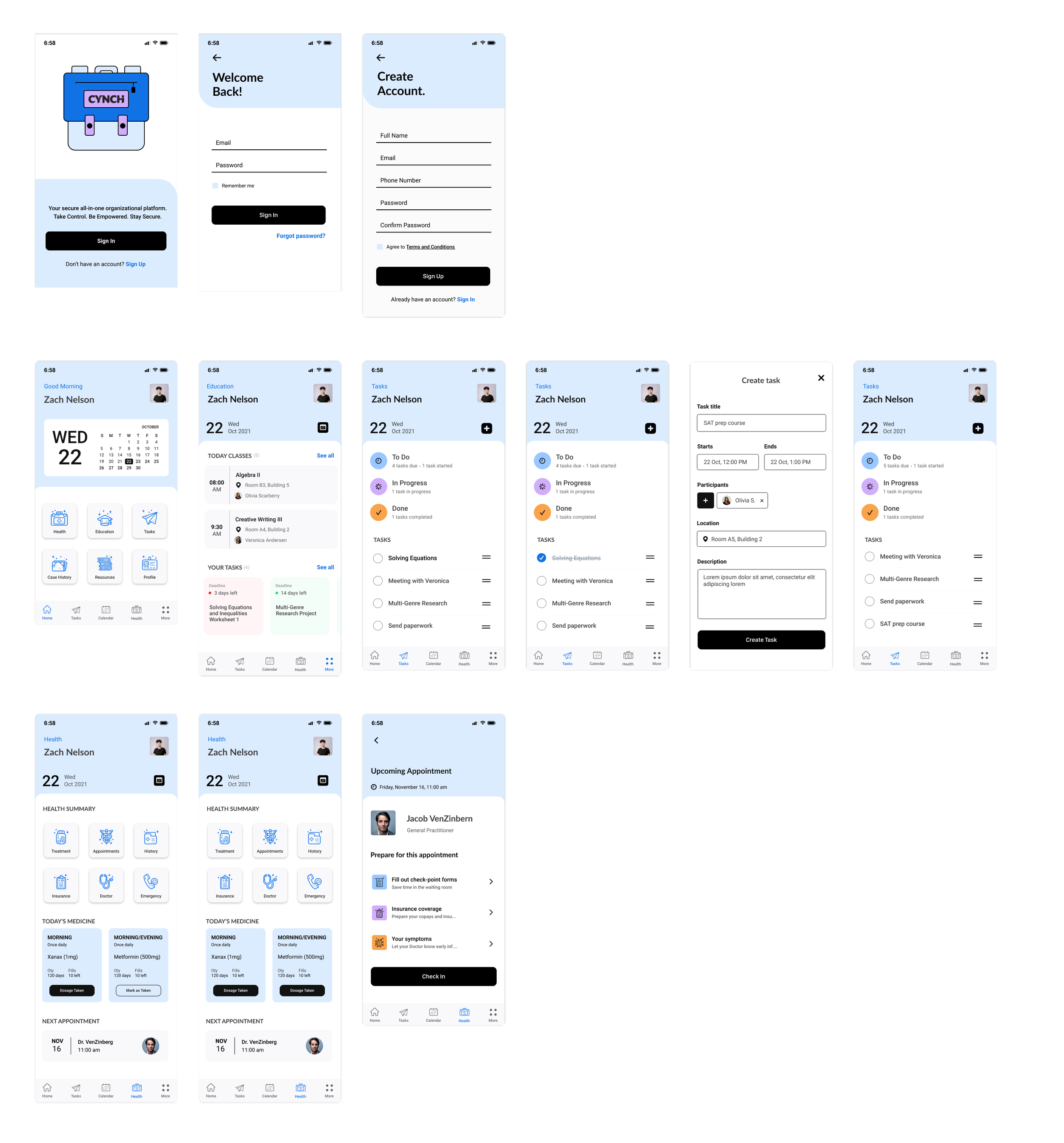

Cynch
Role
Lead UX Designer
Timeline
4 weeks


Background
Working with the company RedMane, I was tasked with branding and designing a mobile app for youth (16+) in alternative care (foster, kinship or residential care) scenarios.
Overview
This application will provide a means by which a young person who doesn’t have access to their biological parents and very little (to no) control over the day-to-day security (where they will live, where they will go to school, access to their medical information) might be able to take a little more control over their own data and details.
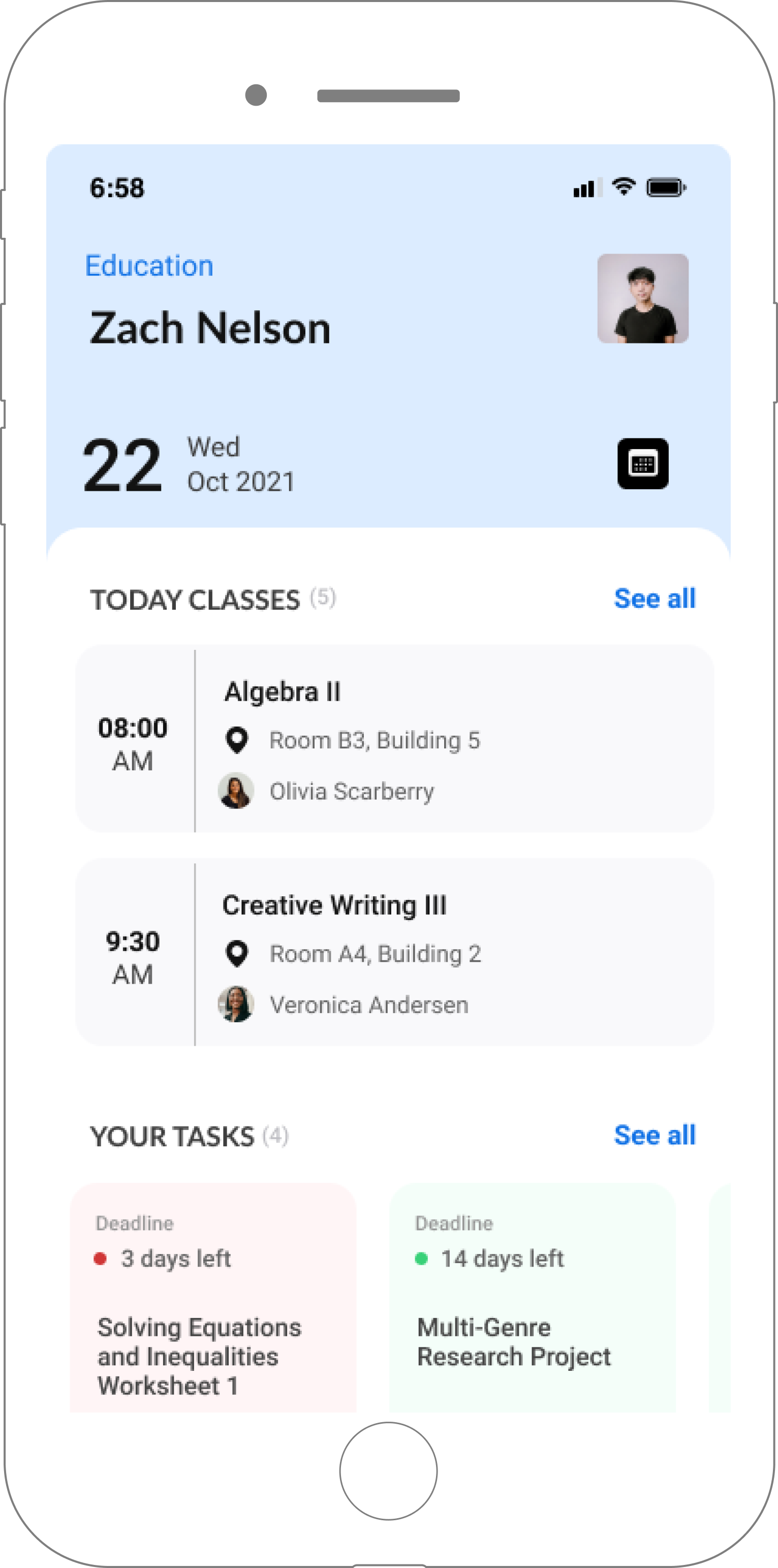
The app will work as a space for the user to access information such as personal information, activities, school tasks and meetings, medical information, and caseworker history.
Interview with the stakeholder
I conducted an interview with the Director of Product Development and the Senior Software Developer at Redmane to better understand who the users are and the goals, pain points and assumptions that Redmane has for the application Cynch..
Research
Research GoalsGain an in-depth understanding of the foster care system and how user experience plays a factor virtually.
Identify trends and insight into competitors and how they’ve accomplished creating an app for people in foster care and how they navigate
Identify in-direct competitors that create apps for Cynch’s age demographic and gain an understanding of their trends and ideologies
Gain a deep insight into Cynch’s users’ goals, needs, frustrations, and motivations.
Market RESEARCH FINDINGSThe Chronicle of Social Change comprised a list of online resources, but the apps that are mentioned for this demographic seem to have been discontinued.
There are not many competitors in this industry. The apps that are on the market are either not specifically for youth, or they have been discontinued.
The product would be provided by the young person’s caseworker.
Many government official apps are not designed with a younger audience in mind.
There is currently little regard for the audience having control over their own lives and data.
User research resultsI conducted an interview of 6 participants of ages 16-22 who were either in high school or college via Zoom to understand what goals or frustrations users have when interacting with these specific apps and to identify and understand the needs and pain points of users using apps to access their medical information. I then had users share their screens and walk me through an app they use frequently to understand their overall experience using an app.
You can view the complete interview debrief here.
Create a space for individuals to access personal information such as where they will go to school, courses they're taking, access to their medical information, etc.
Families are mandated to interact with the organization because of parental failure.
Key words for the brand: Empowering. Enable, Reclaim, Support, Help.
GoalsEnsuring top security methods will be imperative for this kind of system - lots of sensitive information.
This would be a gov issued application distributed through the foster care system/caseworkers
Information-heavy app for a young demographic (16+). It's important to make this app functional but still enjoyable to use.
constraintsIdeation
I began ideation with a few sketches and then expanded upon my design in my wireframes.

expanding upon the iteration
UI wireframes - pre testing
Final frames
featuresThe calendar overview on the home screen will click into a full calendar with a task overview
Courses and task overview, ability to edit, add and delete
Medical history and appointment overview. Ability to fill out forms and check in appointments.
next stepsCalendar page
Case history page
Form completion